Saturday 1 October 2011

Blog Assignment 9: Politics of Design: the Cold War, modernism + democrac

I will demonstrate that Lynx and the ideology that pulling women is of the utmost importance in today's society. With the lack of world wars and international strife the branding of today has shifted from the political to the ideological. Technology has given the everyday civilian more access to so much more information than in the days of WW1 and WW2 that consumerism has to take a different approach. Selling 'sex' is the most common form of this today and is used to sell almost everything. One great proof of this is Lynx deodorant saying through its branding that if you use it you will pull girls. As shown below this is demonstrated on the container with a mathematical formula suggesting that if science proves it this must be true. In fact one man believed this so fervently he sued lynx after 7 years of using the product and failing to get a girlfriend.*
 So while the method has shifted this is still driving forward the ultimate goal of consumerism, which drives capitalism.

*Ben Spencer (Oct. 31 2009). Man sues Lynx after failing to pull in seven years. Retrieved Oct 1 2011 from http://www.dailyrecord.co.uk/news/weird-news/2009/10/31/man-sues-lynx-after-failing-to-pull-in-seven-years-86908-21786843/

Blog Assignment 8: Modernism: standardisation, rationalisation, and the search for the universal

I will altercate that design today is both an art and a science and that it is a result of function x economy. This equation states that design is driven from the technology available today and the products ability to be manufactured easily and cheaply. A great example of this is the skyscraper that we see on every corner of the modern world. As Raizman said in "The first machine age of Europe"*, "The equation of progress with standardized apartment blocks and minimal metal and glass furnishings designed for mechanized mass production might best be seen as a response to the needs of a monolithic public during times of economic hardship."
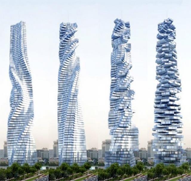
 As we can see above this simple and affordable design has been adopted everywhere and is the face of our cities. The manufacturing technology allowed the construction of these towering structures at a low cost and so drove this minimalistic design. However with technology bringing cheaper ways to do things it also brings the ability to create beauty in new and exciting forms.
As seen here the once straight lines of the classic skyscraper have been twisted into new beautiful forms by the hand of technology. Expressing that art is as much a part of design today as science and in many cases they are the same thing.

*Raizman, D. (2004). The First Machine Age in Europe, in History of Modern Design (pp. 166-191) New Jersey: Prentice Hall Inc.

Blog Assignment 7: Narratives of Progress

I will argue that social networks such as facebook is the creation of the most real symbolic universe to date. The social network creates this online world for people where everything is displayed for them; who is their friend, who's a friend of a friend, whether or not they or someone else is in a relationship, etc. As Khilstedt said in Utopia realized* "technology was capable of creating a perfect society" and in facebook we are seeing this come true. This exactly organizes the social world as comprehensible and connected and is a place where one feels comfortable and safe as they know this universe as it is all displayed for them. As more people use this network it becomes more real for them and start to have more effect on their real lives. The media uses this to place advertising and such to feed off of this and designers are heavily involved in the creation and change of these social networks as they understand what the public wants hence their success.

*Kihlstedt, F. (1986). Utopia Realized: The World’s Fairs of the 1930s in Imagining Tomorrow: History Technology, and the American Future (pp.97-118). Cambridge, Mass.: MIT Press.

Monday 12 September 2011

Blog Assignment 6: Modern Vision


Authentic works of art these days are not seen in the manufactured world. People do not create an item once for one person as this is more effort for less profit which is what more artisans are focussing on now. Their is more of a sense of once you get an item that is mass produced, one must place their own authenticity on it by way of customising it. Their may well be a million sets of headphones like mine but if I paint my own design on them then their are none that look exactly like mine and I have now placed my own authenticity on that item. So where Walter Benjamin says “To an ever greater degree the work of art reproduced becomes the work of art designed for reproducibility. From a photographic negative, for example, one can make any number of prints; to ask for the authentic print makes no sense.”* and "In principle a work of art has always been reproducible. Man-made artefacts could always be imitated by man."* The key word here being imitated and not identical copies as we see today. While I agree that the authentic has changed and disappeared from the manufacturers hand I believe that we are entering an age where we become our own artisans for authenticity. That we take what has been mass produced and bought by millions and we make it our own and therefore make it authentic. So really I do believe that there is a role for the ‘authentic’ in an age of digital design and manufacture but it comes after this stage.

Blog Assignment 5: Colour—abstraction, perception and modernity

Colour Vision, in my opinion best seen in the above example of colour contrast where the same colour will look different to our eye depending on the surrounding colour. Our colour vision, our ability to perceive colour is something that has been experimented on by many over the centuries including painters and scientists and mathematicians. This colour contrast according to John Gage in Colours of the Mind* said that it was Leodardo da Vinci who first noticed this and himself said, "The mutual reaction of colours placed close to each other so when their appearance changes more or less noticeably, has long been noticed by painters and has been labelled contrast by them."* So painters have been aware of this for a long time and have been using it in their work to use surrounding colours to alter the appearance of others in our perceived colour vision.

*Gage, J. (1993). Colours of the Mind in Colour and Culture: Practice and Meaning from Antiquity to Abstraction (pp.191-212). New York: Thames and Hudson.

Blog Assignment 4: Ornament or Nature

The iphone one of the most used pieces of technology today shows exactly this quote of "The evolution of
culture is synonymous with the removal of ornament from objects of daily use.” It shows how as we evolve and our technology increases the need for ornamentation decreases in fact the aesthetics of the iphone are as minimalistic as possible proving that now less ornamentation is beauty in our eyes. It all stems from this design for practicality where ornament has no place, ornament does not fit the shape of your hand or give useful clear information. Adolf Loos said "We have outgrown ornament, we have struggled through to a state without ornament. Behold, the time is at hand, fulfilment awaits us." Even he knew that we were moving past the need for ornament and moving on to the more practical, the minimal, and in our eyes now, the beautiful.

Thursday 28 July 2011

Blog Assignment 3 (Ornament Constructed)

Pistol with singing-bird Ornamental watch in the shape of a flintlock double-barrelled pistol Rochat, Geneva - ca. 1810. 

“Construction should be decorated. Decoration should never be purposely constructed.”
The above watch is the perfect example of ornament or decoration constructed. Anyone who actually attempted to wear this would have quite the weight on their wrist not to mention hitting everything anywhere near it. This watch is obviously not practical in the least and the actual clock looks as if it was added as an afterthought. All of the colours and gold embellishments add to the idea that this is never meant to be worn just looked at so what purpose could it serve in being a watch.
When anything is designed it should be designed for its use first and formost so as to fulfill its purpose. Decoration can then be added to make it asthetically pleasing. By turning something that looks good into another tool or object you are going to create something that is never going to work even remotely well and is ultimately useless as anything but an ornament.

Thursday 21 July 2011

Blog Assignment 2 (The Continuing Curve)

The straight line. The best example that comes to mind of the continuing curve is the big flat trapezoidal shape of the Lamborghini Countach of the 70's-80's perfectly embodying this straight line design as a beautiful car.

And opposed to this would be the latest creation by Lamborgini the Aventador which is a much more fluid form with all these flowing curves and surfaces really showing how the curve is beautiful.
And the Countach really was the beauty of its time as its name is literally an exclamation Italion men make usually when they see a gorgeous women. It was the pin up car on boys walls all across the world as the ultimate object that they all dreamed to have. Whereas these days when we see a car with all the straight lines and not a single curve we think old and outdated. Curves are the latest definition of stunning form as we can see in the 2012 Aventador. Though there is the odd straight line as almost a throw back to the old design this is where we are at the moment and in ten to 20 years we will probably see a lot more flat shapes and forms in whatever we are driving.

Thursday 14 July 2011

Blog Assignment 1. Interactive fun is important.


The Neocube is an important piece of design in my opinion because happiness is key to people having good lives. This cube is very inovative in that each metal ballis a magnet and together they attract each other in a way that lets you create some amazing shapes. There are a million and 1 ways to use this fairly simple design and that is also a good way of keeping peoples minds active. here is a link to a video of just a few of the things you can do with it.
http://www.youtube.com/watch?v=rFplmfNsFns&feature=player_embedded#at=36

Sunday 12 June 2011

The Word. PASSION


For my word Passion I wanted to show both references to the car and to the passion that I believe the company has. Tyre tread was used for the grid as it was the best grid that is physically part of a car. It also proved to be a nice medium to work with as rubber can be cut easily. For the thread I used burning string the string was more to direct the flames but had a nice effect when it was charred and also the embers on the tips I feel looked quite good. Fire I believe shows passion very well as the fluidity of it speaks of this.

The Letter


(for the parts that are difficult to read)

Dear Lamborghini Board of Directors
I am writing this as a design student in New Zealand to share my opinion on your company and brand. I feel that as a company you show great passion in everything that you create. You don’t just make cars you bring them to life. Not only this but you continue to bring about cars that embody the spirit of the fighting bulls of their namesakes.
At present you are seen as a company that creates supercars for people with a true passion for speed and style. I believe that if you design cars with the essence of the bull driving the forms then your cars will continue to captivate these people as they do me. Show enough passion and soul in the shape and body of your cars and the people will see this and understand the passion that is Lamborghini.
Forever a fan
Zac Bird

The Poster


The finished poster showing the opposing ideas of evolving forms and tradition. I liked the idea of seeing these ideas actually facing off against each other so the rampaging bull worked perfectly. With the in situ photo I wanted to show it next to some current fluid forms and shapes that represented my side of the arguement.

Monday 6 June 2011

The Plan

My plan for the word is to use tyre tread as the grid and to use something flammable so that flames are the thread. For the letter I will paint it in black paint to give a motor oil look and it should look passionate as opposed to just typing it. For the poster I am facing off evolving forms vs. traditional shapes so I want to use the bull from the Lamborghini logo and have them facing off against each other.

Wednesday 18 May 2011

Group Kasi Logo and Slogan

Final logo and slogan for Kasi Running Shoe brand. In my group are 
Levi Berge, Zachary Freiberg, Joy Whittington, Zac Bird.


Tuesday 10 May 2011

So here is my final video clip. "Design is Escapism" was the theme that I went with as it shows the imaginative side of design. I went with a black and white base to the clip to represent "real life" with the imagined parts in colour to emphasize their significance. I wanted to bring across how design made the things you imagine to life and create whatever you want.

Final Clip


So here is my final video clip. Design is Escapism was my theme as I wanted to show the imaginative side of design. Also how that side is made real through design. I used a black and white base for the real life parts and colour for all the "imagined" parts to really emphasize them.

Wednesday 13 April 2011

DSDN 101 April Hand In 2 second Clip

My video clip showing the sort of style I want to have in my final video. The real world being in black and white with the imaginative visuals in colour to emphasise them as being more creative.

DSDN 101 April Hand In Story Board


In my video I want to show myself walking down the street and as I see things my imagination takes over and starts changing things in front of me. These changes are not just visual however and act as if they were real.

Tuesday 12 April 2011

DSDN 101 April Hand In Mind Map


With my degree being Media Design minoring in Computer Science and my goal to become a Game Designer
focusing my mind map was relatively easy. What I really wanted to focus on was the idea of escapism as having
no limits or restrictions is something that really appeals to me. Therefore my video will be based on the idea of
"Design is Escapism."

Wednesday 30 March 2011

Zac Bird DSDN101 P1 Typography

My typeface dubbed "Modern Decay" is based on the quote " The disease that is modernism" from the Helvetica documentary. I liked the idea of a font that was falling to pieces from decay and started with one that I felt looked fairly modern. The colours I chose reflect disease in my mind and enhance that sense.

Zac Bird DSDN101 P1 Axo

The Axo drawing shows the motion of the camera lenz extending as it is turned on. I wanted to show the shutter opening at the same rate as I noticed occurs after watching the motion a few times.

Zac Bird DSDN101 P1 Sketch

My "Sketch" drawing was based on the negative drawing which used smudging pencil shavings to get a fill effect and masking off areas to get a clean sharp edge.

Zac Bird DSDN101 P1 Section

My section was of a steel craft knife focusing in on the screw device which slides the blade and holds the whole thing together making it a very central and important part.

Zac Bird DSDN101 P1 Hatch


Here is my final hatch. I wanted to stick with straight lines and see what visual effects I could create such as the 'checkered vortex' up top right. The hatching increases in density from bottom left to top right.

Zac Bird DSDN101 P1 Draw

This is my final draw sketch. I wanted to show the different materials of the camera without rendering it so I used hatch lines and black fill to do this.

Zac Bird DSDN101 P1 Identity

Here is my final indentity sketch. I used my phone, keys, two pens and a lead case. I thought the keys controlling the shape of everything gave it the look of an explosion so I rendered it to reflect this.

Monday 7 March 2011

Hey all. Im Zac and this is my Rapid Visualisation Blog for design at Victoria University. Should soon be full of my work so until then....